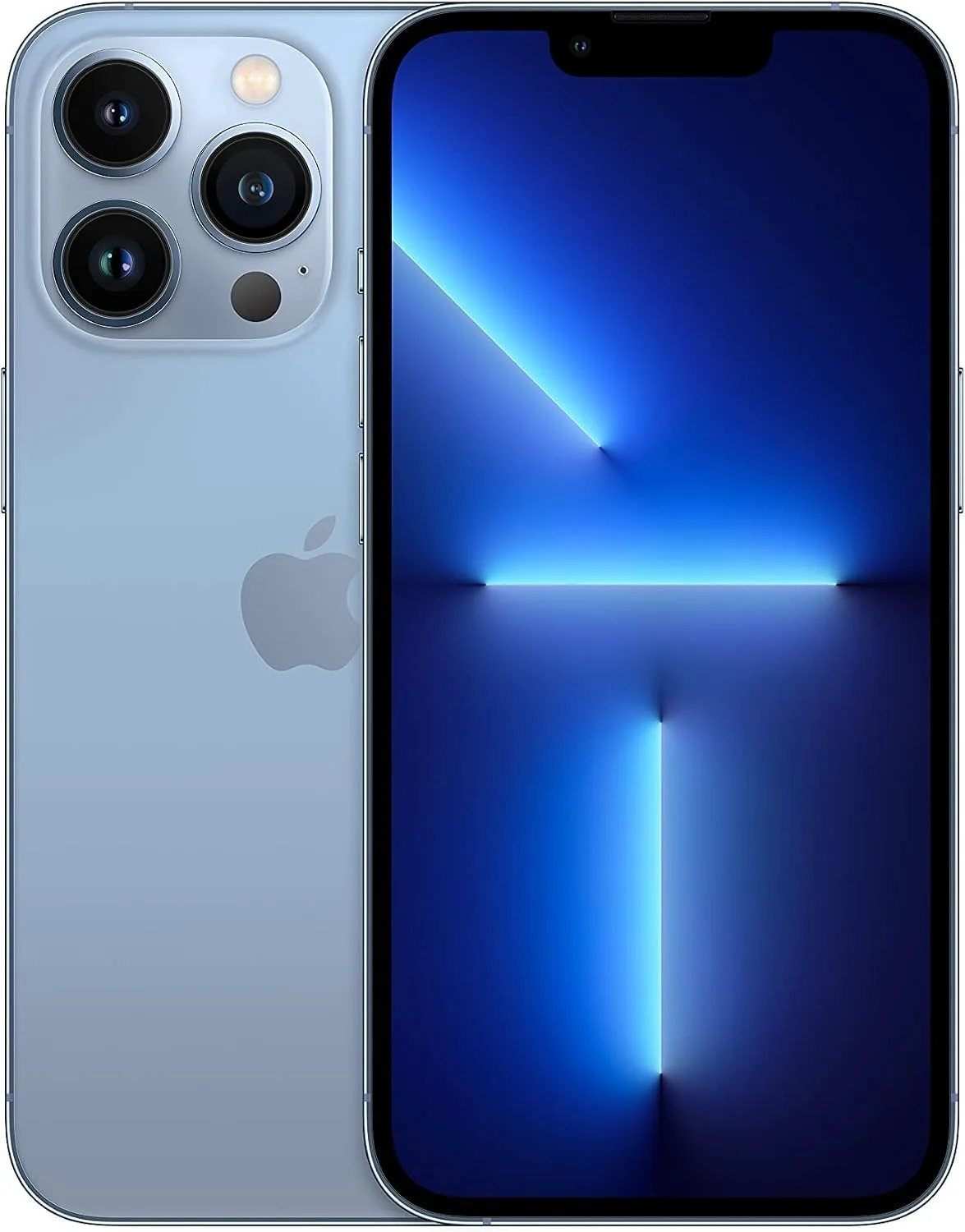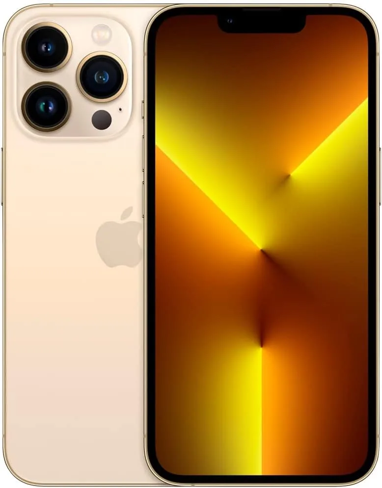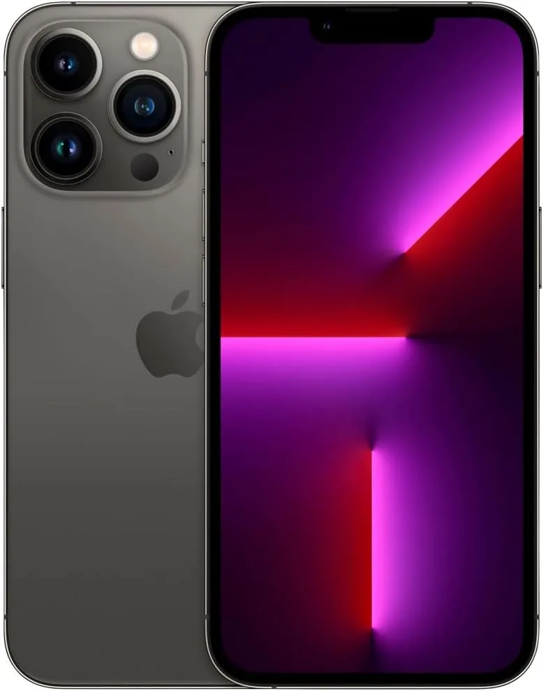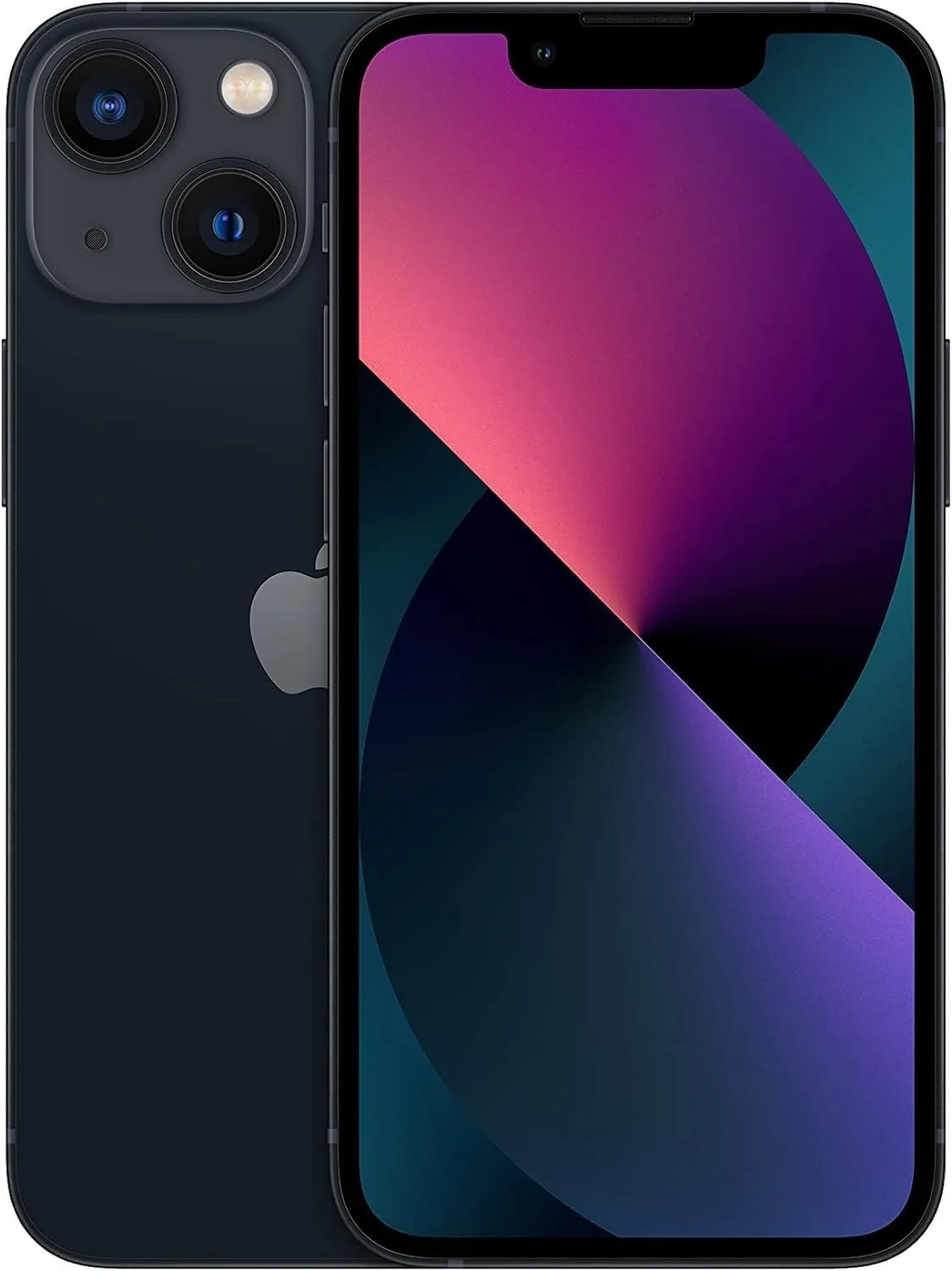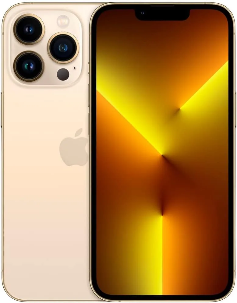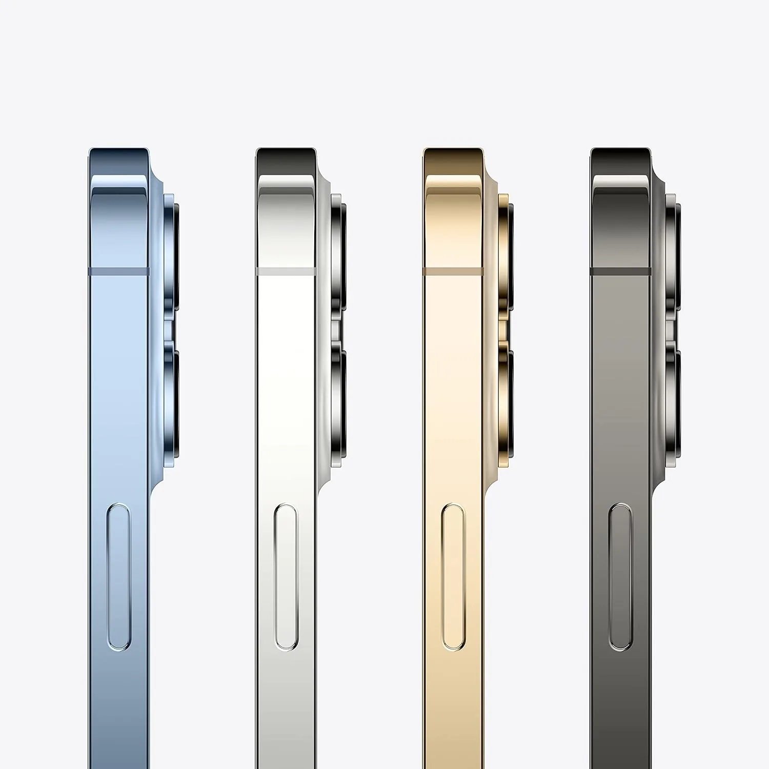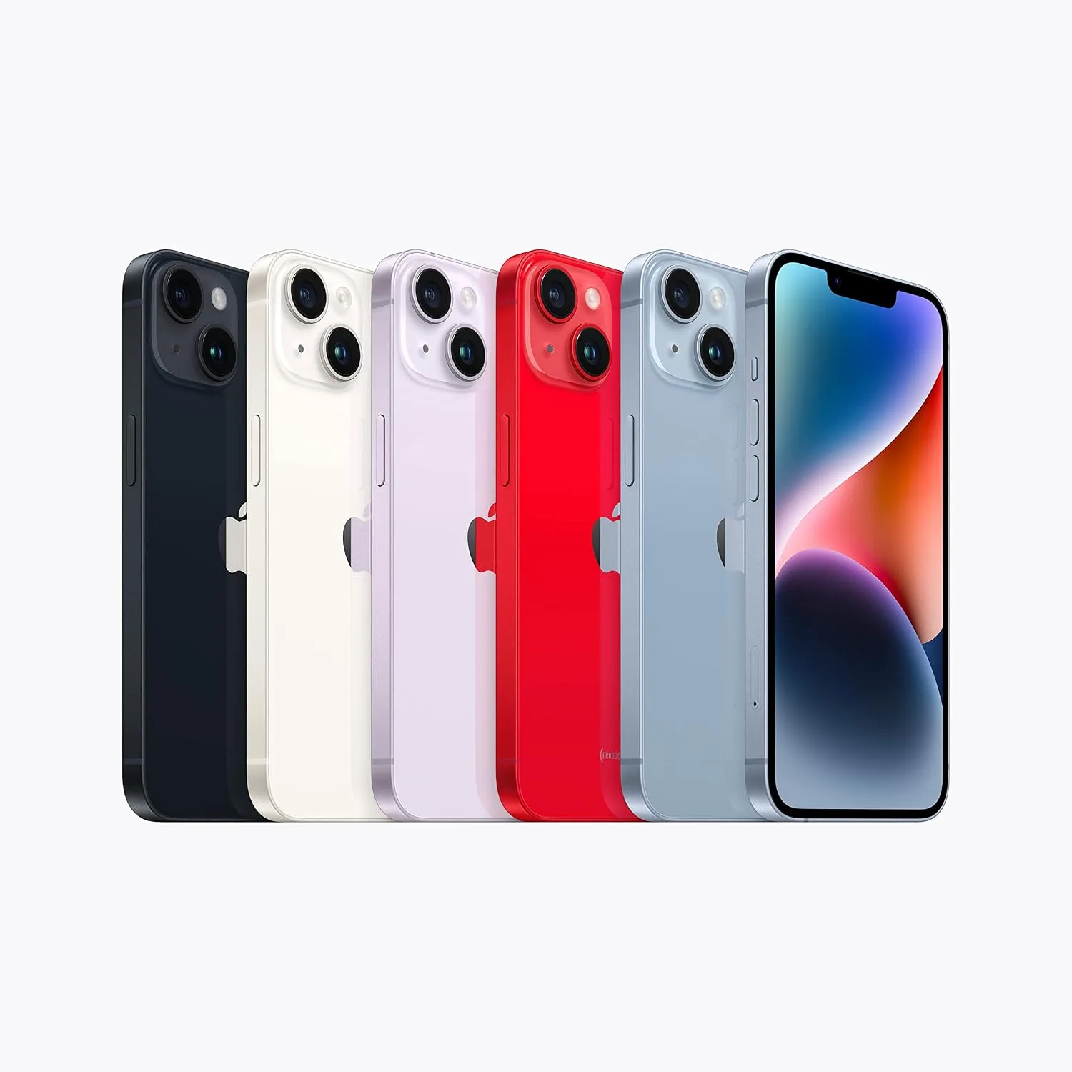
Once you've decided between the iPhone 18 Pro and Pro Max, and settled on your storage capacity, there's one more genuinely personal decision left: which of Apple's four launch colours to actually buy. Unlike the size and storage decisions, which come down to fairly objective trade-offs, colour is where personal taste, practicality, and even resale considerations all genuinely matter — and it's worth thinking through properly rather than picking on impulse in the shop.
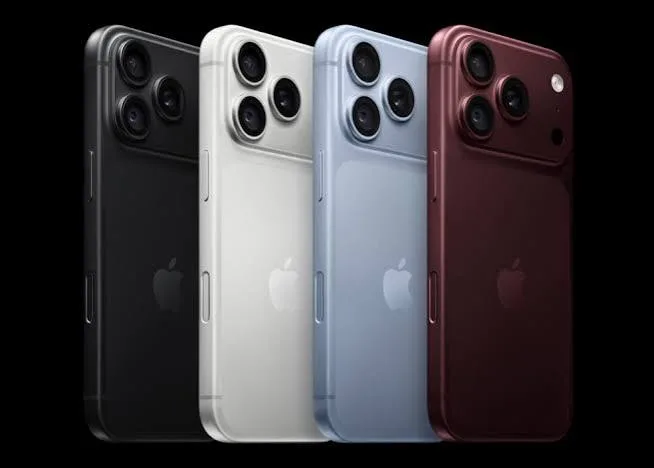
This guide walks through all four iPhone 18 Pro and Pro Max launch colours — Burgundy, Black, Silver, and Glacier (Apple's official name for this generation's blue finish) — covering what each one actually looks like in daily use, who tends to gravitate toward each, and a few genuinely practical considerations specific to buying and owning a phone in Nairobi that go beyond simple aesthetic preference.
Burgundy: The Genuine Hero Colour of This Generation
Burgundy is unmistakably the colour Apple built its entire iPhone 18 Pro marketing campaign around this year — a deep, rich wine-red finish that's noticeably different from anything in recent iPhone colour history. It's worth understanding why Apple chose to lead with this specific shade: after several generations of more muted, business-appropriate colour options, Burgundy represents a genuine return to a bolder, more distinctive Apple colour statement, similar in spirit (though not shade) to how past standout colours like Product RED or Deep Purple captured attention in their respective years.
What it actually looks like in daily use: Burgundy reads as a genuinely sophisticated, warm dark red under most lighting — closer to a fine wine or dark cherry than anything approaching pink or orange. In direct sunlight, the finish takes on subtle warm undertones; in low indoor lighting, it can read almost black until light catches it at an angle, revealing the true depth of the colour.
Who it genuinely suits: Burgundy is the colour for buyers who want their phone to feel distinctive and are comfortable standing out slightly rather than blending in. It photographs beautifully for social media content, which matters if you're at all active in Nairobi's genuinely thriving tech and lifestyle content creation scene. It also pairs exceptionally well with both gold and rose-gold toned accessories and cases, if that's your aesthetic preference.
A practical consideration: because Burgundy is the hero colour and the one most prominently featured in Apple's own marketing, it's often the colour in highest initial demand and can be the first to sell out or command a slight premium during the early launch window in any market, Kenya included. If you specifically want Burgundy, it's worth not waiting too long to secure your unit.
Black: The Understated, Universally Practical Choice
Black remains the colour most buyers gravitate toward when they want their new iPhone's genuine technology to speak for itself rather than the finish drawing attention. This generation's Black is a deep, matte-finished unibody aluminium frame that reads as genuinely premium and professional in virtually any setting.
What it actually looks like in daily use: Black is the most visually "quiet" of the four launch colours — it doesn't shift noticeably under different lighting the way Burgundy or Glacier can, giving it a consistent, predictable appearance whether you're in bright Nairobi midday sun or a dim evening setting. It also, practically speaking, shows fingerprints and light scuffs somewhat less obviously than the lighter Silver finish, though a case is still worth using regardless of colour choice.
Who it genuinely suits: Black is the default choice for professionals who want a phone that looks appropriate in any business context — client meetings, boardrooms, formal settings — without drawing any unwanted attention or being read as flashy. It's also simply the safest choice if you're buying as a gift and aren't certain of the recipient's colour preference, since Black is rarely a colour anyone actively dislikes.
A practical consideration: Black tends to be one of the most consistently available colours throughout a launch cycle, since it's typically the colour Apple and its suppliers produce in the largest initial volumes, anticipating steady, broad demand. If you're not particular about colour and simply want to secure a unit quickly without waiting for a specific shade to become available, Black is usually your most reliable option.
Silver: The Timeless, Brightest Option
Silver has been a consistent presence across nearly every iPhone generation, and this year's version continues that tradition — a bright, polished aluminium finish that reflects light distinctly differently from the three other, darker or more saturated launch colours.
What it actually looks like in daily use: Silver is genuinely the brightest and most reflective of the four options, giving it a clean, almost jewellery-like quality in good lighting. It pairs cleanly with literally any case colour or accessory choice, since it doesn't compete visually with anything you might pair it with the way a bolder colour like Burgundy can.
Who it genuinely suits: Silver suits buyers who specifically want a colour that will still look fresh and appropriate in two or three years' time, without feeling tied to a particular colour trend from this specific launch year. It's also the practical choice for anyone who dislikes the way darker finishes show fingerprints and light scratches more visibly — Silver's brightness and reflective quality genuinely camouflages minor surface marks better than Black or Burgundy.
A practical consideration: Silver has historically shown strong resale value retention in Kenya's secondhand phone market specifically because of its universal, timeless appeal — buyers looking for a used iPhone a year or two from now are rarely put off by a Silver finish the way they might be by a bolder colour choice that's fallen out of fashion.
Glacier (Blue): The Cool-Toned Alternative
Glacier is Apple's official name for this generation's blue finish, and it sits as the genuine middle ground between Burgundy's boldness and Black or Silver's neutrality — distinctive enough to feel like a deliberate colour choice, without being as attention-grabbing as the hero Burgundy shade.
What it actually looks like in daily use: Glacier reads as a cool, crisp, almost icy blue under most lighting conditions, living up to its name. It has a genuinely calming, understated quality that differs meaningfully from warmer blue tones used in some past iPhone generations — this is a cooler, more silvery-blue rather than a deep navy or vibrant royal blue.
Who it genuinely suits: Glacier suits buyers who want something visually distinct from the ubiquitous Black and Silver options, without committing to Burgundy's bolder statement. It's a genuinely popular middle-ground choice among buyers who find Black "boring" but Burgundy "too much."
A practical consideration: Because it's a genuinely new shade of blue for this generation rather than a repeated colour from previous years, Glacier tends to appeal particularly to buyers upgrading from an older iPhone who specifically want their new phone to look visibly different from their previous one at a glance.
Colour and Practical Nairobi Living Conditions
A few genuinely practical considerations worth factoring in, specific to daily life in Nairobi, beyond pure aesthetic preference:
Dust and matatu dust exposure: if you commute regularly on Nairobi's roads, particularly on routes with more exposed dust, darker colours like Black and Burgundy show settled dust and light surface grime slightly more visibly than Silver or Glacier's lighter, more reflective finishes — though this is a minor consideration easily addressed with a quick wipe-down or a case.
Heat and direct sun exposure: darker colours, Black and Burgundy specifically, absorb slightly more heat than Silver or Glacier when left in direct sunlight — for instance, on a car dashboard or a table near a sunny window. This is a genuinely minor effect in practice given how briefly most people leave their phone in direct sun, but worth knowing if you're deciding between colours for a phone that will spend real time exposed to Nairobi's strong equatorial sun.
Visibility for security awareness: this is worth mentioning honestly — a distinctive, attention-drawing colour like Burgundy is, by definition, more visually noticeable than a neutral Black or Silver phone. This isn't a reason to avoid a colour you genuinely love, but it's worth being generally mindful of how and where you use any smartphone in public spaces, regardless of colour.
Does Colour Affect Price in Kenya?
Generally, no — Apple prices all four launch colours identically at a given storage tier, and this pricing structure typically carries through to genuine retailers in Kenya as well. Where you might occasionally see a price difference is purely a function of supply and demand during the launch window specifically: if Burgundy is in noticeably higher demand and shorter initial supply than, say, Silver, some sellers may price it at a modest premium simply because they can, while others hold firm to consistent pricing across all colours. This is worth checking directly with your specific seller rather than assuming, and it's a reasonable question to ask if you notice a price gap between colours that seems unexplained.
Resale Value Considerations by Colour
If you tend to upgrade your phone every one or two cycles and care about resale value when you eventually sell or trade in your current device, colour genuinely does factor into Kenya's secondhand market, even if modestly. Black and Silver consistently show the broadest resale appeal, since they suit the widest range of buyer preferences and never feel dated or trend-specific. Bold, generation-specific colours like Burgundy can occasionally see slightly reduced demand once a newer generation's own hero colour arrives and captures attention instead, though this effect is generally minor for a device as consistently in-demand as an iPhone regardless of finish. If resale value is a genuine priority for you, leaning toward Black or Silver is the statistically safer choice — though the difference is rarely large enough to override a colour you'll simply enjoy using more in the meantime.
How Colour Interacts With the New Camera Bump and Buttons
It's worth mentioning a detail specific to this generation's design: the unibody aluminium frame covers the sides, the camera housing, and part of the back of the phone, meaning your chosen colour is visible not just across the flat back panel but also around the raised camera module and the phone's edges. This is genuinely different from generations where only the back glass carried the colour, with a separate metal frame in a neutral tone. In practice, this means your colour choice now reads as a more complete, cohesive design statement across the whole device, rather than being confined to the back panel alone — worth keeping in mind if you're picturing how a colour will look from different angles, including when the phone is lying face-down on a table or being held from the side.
Matching Your Colour Choice to Your Existing Apple Accessories
If you already own Apple accessories — a MagSafe charger, AirPods case, or an Apple Watch you regularly pair visually with your phone — it's worth a moment's thought on how your new colour choice will sit alongside what you already own. Silver and Black remain the two most versatile choices for buyers with an established collection of accessories in varying colours, since neither clashes with anything. Burgundy and Glacier, being more distinctive shades, are worth considering specifically if you're open to coordinating future accessory purchases — a Burgundy-toned case or a complementary Apple Watch band, for instance — to build a more intentional, coordinated look across your devices.
How to Choose: A Simple Framework
If you're still undecided, work through these questions:
Do you want your phone to be a genuine style statement, or to blend in? If you want it noticed, Burgundy. If you want it to disappear into the background of daily life, Black or Silver.
Are you upgrading from an older iPhone and want your new one to look visibly different? Glacier or Burgundy will feel like a genuine change; Black or Silver will feel more familiar.
Do you care about resale value down the line? Lean Black or Silver for the broadest, most consistent secondhand appeal.
Do you dislike fingerprints and light scuffs being visible? Silver and Glacier's brighter finishes camouflage minor marks somewhat better than the darker Black and Burgundy options.
Is this a gift for someone whose colour preference you're unsure of? Black remains the safest, most universally acceptable default choice.
Seeing Colours in Person Before You Decide
Photos and screen renders, including the ones on retailer websites and even Apple's own marketing materials, genuinely don't always capture exactly how a colour will look in your hand under Nairobi's specific lighting conditions — screen colour calibration varies, and lighting in a photograph is rarely identical to natural daylight or typical indoor lighting. If you're genuinely torn between two colours, it's worth visiting a shop in person specifically to see the actual units side by side before committing, rather than deciding purely from online images.
The Psychology Behind Why Colour Choice Feels Harder Than It Should
It's worth acknowledging something honestly: choosing a colour for a purchase this significant often feels disproportionately difficult compared to how genuinely different the options actually are underneath. Part of this comes from the fact that, unlike storage or screen size, colour carries no functional trade-off at all — every other decision in this buying journey has a "right" answer based on your usage pattern, but colour is purely aesthetic, which paradoxically makes it feel harder to commit to rather than easier. There's no wrong answer here in the way there might be a wrong storage choice for someone who shoots extensive video. Give yourself permission to simply pick the one you're drawn to on sight, rather than overthinking a decision that has no functional consequence.
How Lighting in Nairobi Specifically Affects Colour Perception
Kenya's equatorial position means Nairobi generally receives strong, fairly consistent natural daylight year-round, without the dramatic seasonal lighting shifts some other markets experience. This actually works in your favour when colour-matching in person: a colour you see in a shop during a typical Nairobi afternoon will likely look very similar under most of the natural lighting conditions you'll actually use your phone in day to day, since the city doesn't see the extended low-angle winter light or heavy grey overcast conditions that can dramatically shift how a phone's finish reads elsewhere in the world. This means a confident in-person colour check at the point of purchase is a genuinely reliable predictor of how the phone will look for you generally, rather than something that might look completely different once you get it home.
Frequently Asked Questions
Is Burgundy genuinely worth choosing over the other colours? If you want the colour Apple built this generation's identity around, and don't mind it being slightly more noticeable, yes. It's a genuinely distinctive, well-executed shade rather than a marketing gimmick.
Which colour is easiest to find in stock right now in Nairobi? Black is typically produced in the largest volumes and tends to be the most consistently available colour throughout a launch cycle, though this varies by retailer and can shift as more shipments arrive.
Does colour affect the phone's performance or features in any way? No — all four colours share identical hardware, chip, camera system, and software. Colour is purely a cosmetic choice with zero functional difference.
Which colour holds its resale value best in Kenya? Black and Silver have historically shown the broadest, most consistent resale appeal in Kenya's secondhand phone market, given their universal, timeless quality.
Is Glacier a dark or light blue? Glacier is a cool, crisp, relatively light and silvery blue tone — closer to an icy or steel blue than a deep navy or vibrant royal blue.
Should I choose my colour based on what case I plan to use? If you plan to keep your phone in a case at all times, colour matters less practically since it'll rarely be visible — though many buyers still prefer choosing a colour they genuinely love for the moments the phone is uncased, and to see through clear cases.
Does the new unibody design change how colours look compared to previous iPhones? Yes — because the aluminium frame now covers the sides, camera area, and part of the back, your chosen colour reads as a more complete, cohesive design across the whole device rather than being confined mostly to the back panel.
Colour Choice for Business and Content Creator Buyers
A few Nairobi-specific buyer segments are worth addressing directly, since colour choice can carry slightly different weight depending on how you use your phone professionally. Real estate agents, insurance sales professionals, and corporate consultants who regularly present a phone during client meetings often lean toward Black specifically for its consistently professional, unobtrusive appearance across any setting. Social media content creators and influencers, a genuinely growing professional category in Nairobi, frequently favour Burgundy or Glacier specifically because a distinctive phone colour becomes part of their visual brand across unboxing videos, reviews, and lifestyle content — the phone itself becomes a recognisable prop rather than an incidental object. Photographers and videographers using the phone as a genuine creative tool alongside dedicated camera equipment often report caring least about colour of the four groups, since the phone spends much of its working life inside a camera bag or rig rather than visible on a table.
The Bottom Line
There's no objectively "correct" colour choice among Burgundy, Black, Silver, and Glacier — each genuinely suits a different personality and set of priorities, and all four carry the identical iPhone 18 Pro or Pro Max experience underneath. Choose based on what you'll genuinely enjoy looking at and using every day, factor in the practical Nairobi-specific considerations covered here if they matter to you, and don't let stock availability alone dictate a colour you don't actually want.
Want to see all four iPhone 18 Pro and Pro Max colours in person before deciding? Visit City Gadgets Kenya or message us on WhatsApp to check current colour availability and get honest guidance on which finish genuinely suits you.